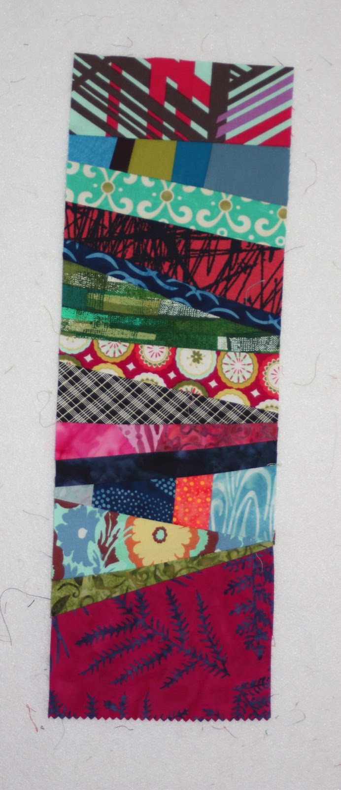
Showing posts with label 15 Minutes Play. Show all posts

Wednesday, January 21, 2015

Word Challenge: Savor!

Each new year, Victoria at 15 Minutes Play puts out a word challenge--pick a word and then make it into a quilt. 

Last year my word was Balance. 

This year I chose Savor. 

Why Savor?
Because I often feel I'm quilting on a deadline--related to either when a project needs to be done, or when I have to stop sewing to make dinner, entertain the kids, go to bed... It's too easy to sew rushed and focus only on the end result, rather than enjoying the process as I go. 

So for 2015, I will savor my time quilting. I will stop and smell the roses, to use a tired cliche, and pay attention to what I'm working on rather than just how close I am to finishing. 
(Well, except for when I'm handstitching a binding on. At that point, I'm ALL about the finish line!)

A little bit about the techniques I used here. I pulled out a bunch of orange scraps to create some monochromatic made fabric. I did applique last year, so I wanted to try a new and different technique for the letters this year, and freehand stitched cursive seemed like a good idea. I wrote the word on the orange fabric with a washable fabric marker, pinned the fabric to batting, and started stitching with my free motion foot. I used four or five different blues, ranging from sky blue to navy, and traced the word multiple times with each color. I wouldn't say I'm in love with the final result, but I'm glad I tried a new technique!


Saturday, April 19, 2014

In Love with Liberated Medallions!

I had a fantastic week! Gwen Marston came to Kalamazoo to the Log Cabin Quilt Guild for two full-day workshops and a lecture. Guess what? I took both workshops. Two full days of sewing--no work, no kids...just fabric play and hanging with quilting friends and learning from the talented, funny, and inspiring Gwen Marston. Lots of fun! 

Want to see what I made? 

The first workshop was Liberated Medallions. We were asked to bring in a center medallion of some type to build around. Because I don't have enough fabric in my stash (ha!) I went shopping the previous Friday and bought the fabrics below:

I struggled with what to for my medallion--I considered just fussy cutting a piece of fabric, but ultimately decided to piece something instead. The timing worked out perfectly, as I'd been watching the Spring Challenge over on 15 Minutes Play and realized I could combine ideas, participating in the Spring Challenge and making it the center of my liberated medallion.

Here's what the Spring Challenge started with, plus the assignment to use made fabric and "think spring."

With a tight timeframe (I began piecing the night before the workshop!), I played around a bit in Illustrator first to figure out what I wanted to do. While I like the star concept, the third design spoke to me so quickly that I didn't even bother to spend time coloring it in.


I dug through my scraps to find fabrics in the colors that matched what I'd bought and started piecing. Because of those extra lines I added, I paper pieced the blocks instead. And skipped the center line in the biggest (teal) triangle. Here are my four made fabric Spring Challenge blocks:
They say spring, don't they?!?!

I quickly got caught up in creating at the workshop itself, and I don't have many in-progress photos. (oops! Truly the sign of having a good time!)

Here's the center medallion with the sashing and first border added:

First pieced border added:

My liberated medallion after the workshop (not complete, but just as far as I got that day):

And a close-up of the borders I added:

I LOVED this workshop--I felt in the groove from the start and enjoyed making pretty steady progress. The "liberated" technique meant very little measuring, a very relaxed attitude, and lots of wonky piecing. I can't wait to see where this piece goes from here! 

And if you ever have a chance to hear Gwen speak or take a workshop from her, jump on the chance! She's delightful and witty, and I loved being able to jump right in and start sewing while she walked around and offered advice, chatted, and shared her enthusiasm. 


Thursday, January 30, 2014

Word Challenge: Balance

Victoria over at 15 Minutes Play issued a challenge early in January--choose a word for the year and make a small quilt with that word on it. It's been fun seeing what everyone has chosen and how they've made their projects! You can see them all here.


I'm not much for picking a word for the year, or for New Year's resolutions, for that matter, but the opportunity to made a word quilt sounded like a lot of fun. 
I chose "balance" for my word because I'm always striving to keep the various aspects of my life--my kids and husband, my job, my family and friends, my sewing time, etc.--balanced. Not necessarily succeeding, but striving! :) Having a visual reminder of this will be nice--helping me to make sure that sewing gets enough time in my life (All to often it gets pushed to "tomorrow," much like exercise. Funny how I can always find time for a bowl of ice cream, though!)

I have a box full of leftover strips and random pieces conveniently located under my sewing table, so I pulled exclusively (and pretty blindly!) from that. I wanted to create a busy, uneven stripe look. I tried hard not to care about what colors went next to each other. 

I went from here: 
Where it sat on my design wall for a week--should I add a border? What color? Should it be pieced? Did I have time to play around with borders? Was that a crash and a cry from the kids' room, and should I check it out, or stay in my studio and assume everything is fine? Did my email just ping? Ten more work emails to deal with before we leave on vacation tomorrow. (Are you starting to see why I chose the word I did?!)


This morning, with the end of the month deadline looming, I jumped in. Cheery gold letters, because I want balance to be a happy thing, not a threat. Tilted stacked letters, because it adds humor to the idea of achieving balance. Gold thread straight quilting lines because I do love straight line quilting, and I'm often too chicken to use bright colors on bigger quilts--perfect to try it here. 
And the binding and flange? Proof that I'm learning balance. I participated in the Challenge, found my 15 minutes to play on several days to make it happen, but didn't make myself crazy by trying to figure out a border. At the same time, I couldn't just leave it with no border and only binding, so I added in the flange. Hooray for compromise! (With 5 year old and 2.5 year old boys at home who seem to constantly bicker, perhaps that should be my word next year...) 


Tuesday, November 12, 2013

How mini is mini?

A couple weeks ago, Victoria posted a Miniature Challenge over at 15 Minutes Play. I knew I wanted to be part of it, but couldn't quite decide how--what kind of block/design? What colors? I'm always more excited about a project when I've got an idea in mind.

Then I saw this pattern:
Cubit from Stitched Together Studios
and I knew exactly what I was going to do! 

The quilt pattern measures 69-1/2" square, so I had to do a little math to shrink the design down to the 12" challenge size. I decided to make just the center four blocks. 

Our weather has been a bit gray and dreary lately, so I gravitated toward bright oranges and yellows for my made fabric. Incidentally, these were the colors of our leaves last week...after the rain (and snow flurries!); they're mostly brown now.

I wasn't sure what colors I wanted to use for the sides of the focal squares, so I auditioned multiple options. It seemed like the obvious answer was to go with some type of grays/blacks, so I tried several of those, experimenting to see if patterned prints would work or take away from the made fabric focal squares. I also threw in a couple colored versions to see how they'd look. The orange/yellow squares measure 3-1/2"; the finished block will measure 12" square.
I was glad I auditioned so many different choices, and while I liked my first choice (upper left--gray solid and darker gray scroll) best, I was surprised at some of the others that I liked as well--especially the pink and purple; it just wasn't the look I was going for with this project.

I played around a bit more in Photoshop to see how the different blocks would look (I realize in real life the blocks would be mirror images...these are just quick mock-ups where I copied, pasted and rotated one block three more times.)

Subtly solid:

Brights; less of an optical illusion:

More traditional fabrics:

Darker shaded tonals:

Medium grays:

Dots in different sizes:

Which do you like best?


p.s. If you like the Cubit pattern too, you can find it here.


Monday, September 17, 2012

Final Color Challenge blocks!

Life got in the way of a lot of sewing in August and my last two color challenge blocks were one of the things that got pushed to the back burner. However, Victoria just started a lights and whites challenge over at 15 Minutes Play, and finishing my color challenge blocks became my personal ticket to joining the new challenge.

Here we go!

Lime Green:
The lime fabric I started with is actually the middle one, which comes out looking very yellow. I liked how it popped with the magenta and pink in the stripe above it.


Made fabric:

Four squares cut from it:

My finished block:
Takeaways:
Lime works with so many different colors. I tried a few other combos out before deciding on this one, and my original idea had been based on the coverlet on our bed while on a beach vacation: coral, lime and salmon. I like it with brighter colors, though, like the orange and magenta, to make it more modern. The dark brown really grounds it as well. Lime can be tricky because it gets BRIGHT really quickly, so I think the challenge for this color is in finding the right hue to work with.

Kelly Green:
Besides the time issue, part of why I had trouble finishing this challenge was that I felt greened out. Which was surprising, because green is one of my favorite colors. I wanted to try something different than the other combos I'd used in this challenge, so I grabbed the purple and the floral and worked off of those.

Made fabric: 

Four squares cut from it:

Finished block:

Takeaways:
I love how bright this turned out! As I mentioned earlier, I do love green, but I usually go for more subtle shades than kelly green. That meant that I was pleasantly surprised with how this block turned out. The pink didn't surprise me, but I was pleasantly surprised with how the yellow and purple accented it.

See my previous blocks here.

So here's where I am right now:
Laying out the blocks was a long process. I'm fairly set on this arrangement, but I want to sleep on it for a few more nights before sewing the blocks together. How do you think I should finish it?

  • No border
  • Beige/khaki border to match the fabric in the blocks
  • Multicolor made fabric border
  • Several borders--multicolor made fabric and beige khaki
  • Something else?
What's your opinion?


p.s. Shades of Gray fabric swap participants, the deadline (September 20) is approaching! 
I still need fabric from 15 or so people. Please get it to me soon so that I can get the squares sorted and mailed back out!


Thursday, July 19, 2012

Color Challenge Block Layout

The other day I posted my latest Color Challenge blocks.
Here, I've laid out all of my blocks in two different orientations. I like both at the moment. I think if I go with the on-point setting, I'll have to come up with some sort of half-block design for the setting triangles, because I'd really like the design to continue to the edges. (Which might be enough to push me to the straight setting!) What setting do you like best?


Monday, July 16, 2012

Color Challenge Catch-Up

I've been (mostly) keeping up with my weekly Color Challenge blocks (except for this past week, when I spent all my free time finishing my beach bag).
If you haven't checked out the Color Challenge over at 15 Minutes Play, you should definitely do so! It's so interesting to see everyone else's blocks, and the woman who started it all, Victoria, is an incredibly talented quilter and colorist. 

Here are my most recent blocks.

Grape
For someone who went to a university that boasted purple and white as its colors, I sure don't have much in my stash! I admit, even after four years of wearing purple, it isn't really one of my favorites.

One thing I've noticed each week that if I'm having trouble finding fabrics to go with the main color, it usually means that I'm not happy with my original fabric. It happened again this week; I switched purples and quickly found some options to play with.

And as I mentioned above, I had a hard time getting an accurately colored photograph of purple, as well as the light aqua (so much more attractive in person!) and the blue I used here and the deeper teal in another quilt top I've just finished. So take these photos with a rather large grain of salt! :)

Fabric choices:
When I took this photo, I was sold on the bottom four fabrics and the four along the top were alternates. I ended up using just one of the alternates.

Made fabric:

And the block:

About the purple:
Yellow was the obvious first choice for me, but I didn't like the first couple I tried--the darker lines in this yellow seemed to help it out. I was really surprised that the blue worked--in my mind it seemed too close to the purple. I didn't want to go very pinky, but the aboriginal dot light purple/pink seemed to set off the purple nicely. Ultimately, for me, purple is just a tough color to work with, and while I'm fine with my block, I'm not feeling any extra love for the hue right now.


Bubblegum Pink
I kept feeling drawn to sugary sweet, bubblegum-y colors for this. 
Here's what I ended up using:

And my made fabric:

And my block:

I think it really has that sugary sweet bubblegum feeling to it. I especially like it with the lime green and the yellow dotted print. Pink is not usually a huge favorite of mine (I just feel like it gets overused for little girls, but that's another soapbox for another day). However I really like all the black, white and pink blocks that others made, and I like how easily it works with a variety of colors in general. I think I may have to overcome my prejudice against it and try a quilt that is primarily pink.

Mint Green
The color mint green has another flavor connotation, too...check out the key lime pie custard I ate before sewing my block!

With that "inspiration" in my belly, I pulled out these fabrics:
I found the third fabric and loved the orangey-red paired with the mint and sage greens, so I looked for that color in my stash. Only after finishing the block did I realize that its colors were similar to my tomato red block!

And here's my made fabric:


And my block:

I was not expecting to pair the orangey-red with mint, but I liked how the warm and cool complemented each other. I'm not usually a big pastel fan, but throughout this color challenge I'm seeing how pastels can be paired with brighter colors for interesting impact.

Aqua
My aqua was plenty bright, so there was no confusing it with mint. (Although when you pair this aqua with the chocolate brown, I'm seeing mint chip ice cream here too!)


My made fabric:

And my finished block:
I love how the bright colors and how they pop with the aqua, but that they're grounded with the brown. I like how the bright colors keep the aqua looking fresh.

Maroon
This was a third attempt at fabric choices for me. I too kept running into the maroon and gold school colors issue. Then I found the small squares fabric and the green millefiore fabric and knew that I'd found my direction. I was pleasantly surprised to see how the coral and the blue worked too--maroon is more friendly than I'd expected. I wasn't expecting to like this block, but I really do!

My made fabric:

And my finished block:

To see my previous Color Challenge post, showing Tomato Red, click here.